Nestlé Purina

I was hired in 2017 as the UX designer for Nestle Purina’s new Pro Plan sites.
Background
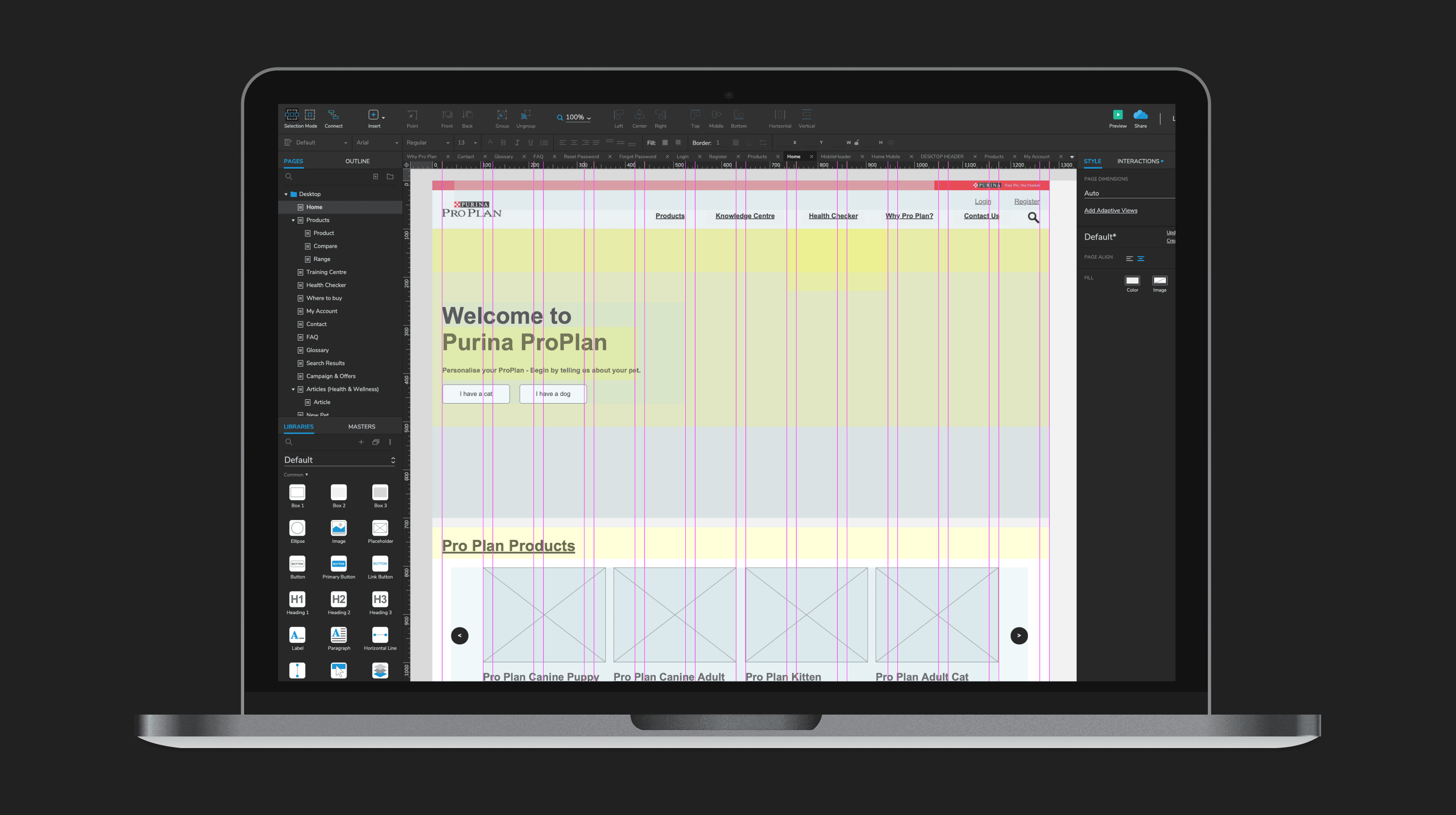
The client was keen to explore functionality deeply at the prototype stage. To this end, I built a prototype of the site in Axure, using scripting and variables to provide an almost fully functional experience, including logged in/out experience sitewide, and the ability to add and customise pets, subsequently receiving dynamic content based on the profile set by the user (e.g., a young puppy, or a senior cat).
Investigation
Purina had identified Royal Canin as a best-in-class example of what they wanted to achieve with their online offering. I began by conducting a heuristic analysis of this and other competitors in the space.
Card Sorting
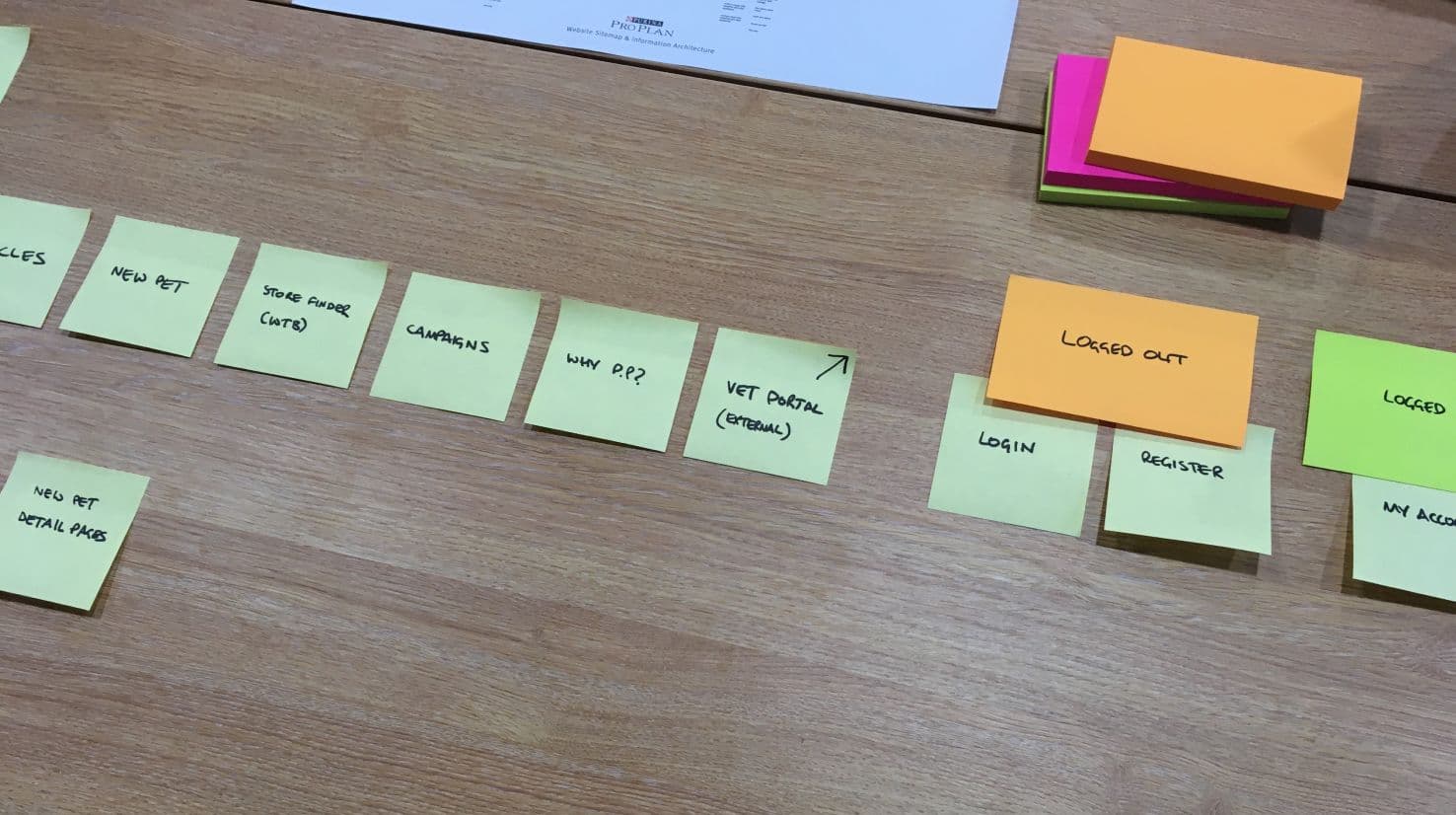
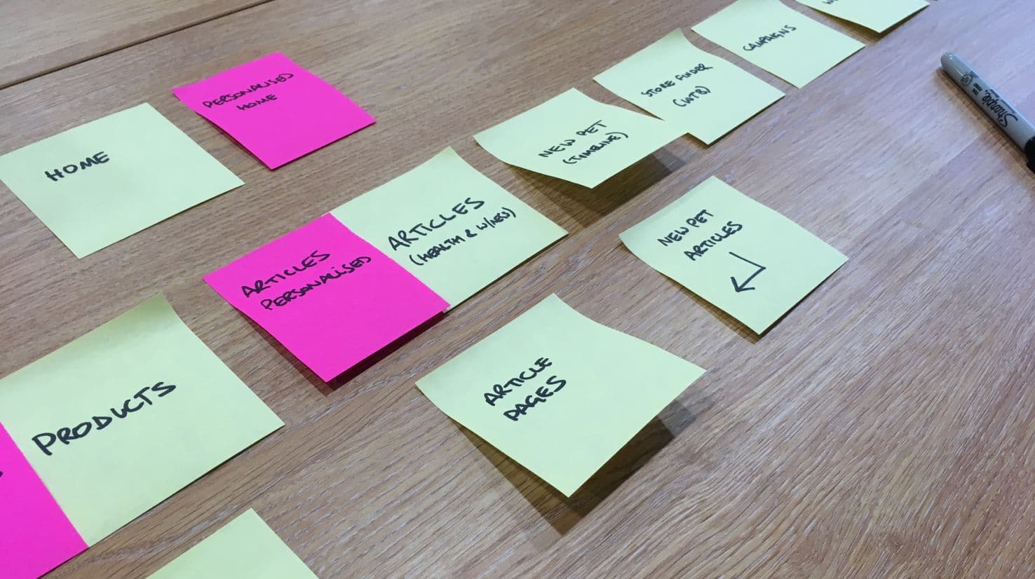
I had come on board at a stage where the business requirements for functionality were well defined. After consolidating my findings from the competitor analysis, I employed a card sorting exercise to determine the optimal IA/sitemap for the functionality and subsequent content.
Prototyping
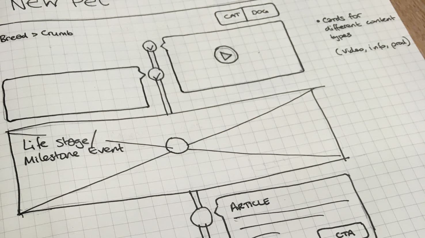
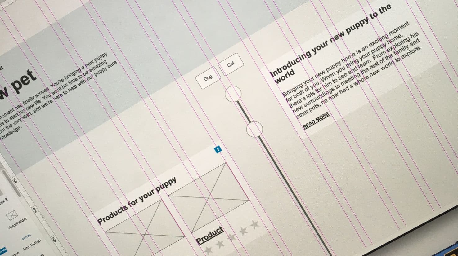
Using an Agile process, bite-sized pieces of functionality were identified and worked on per sprint, with regular calls to demo the prototype with stakeholders. Feedback was quickly assimilated into the prototype. Only when a section was approved in UX did the piece move into design. In this way, design overhead was greatly reduced. The power of the Axure prototype allowed us to walk the client through an almost fully functional journey, making it easy for them to understand how the dynamic experience would work without committing to design or build until consensus was reached. I used scripting and variables to create a complete end to end experience for both logged in and logged out states, featuring the ability for a user to add pets and recieve dyamic updates concerning them on the user’s customised homepage.
Design
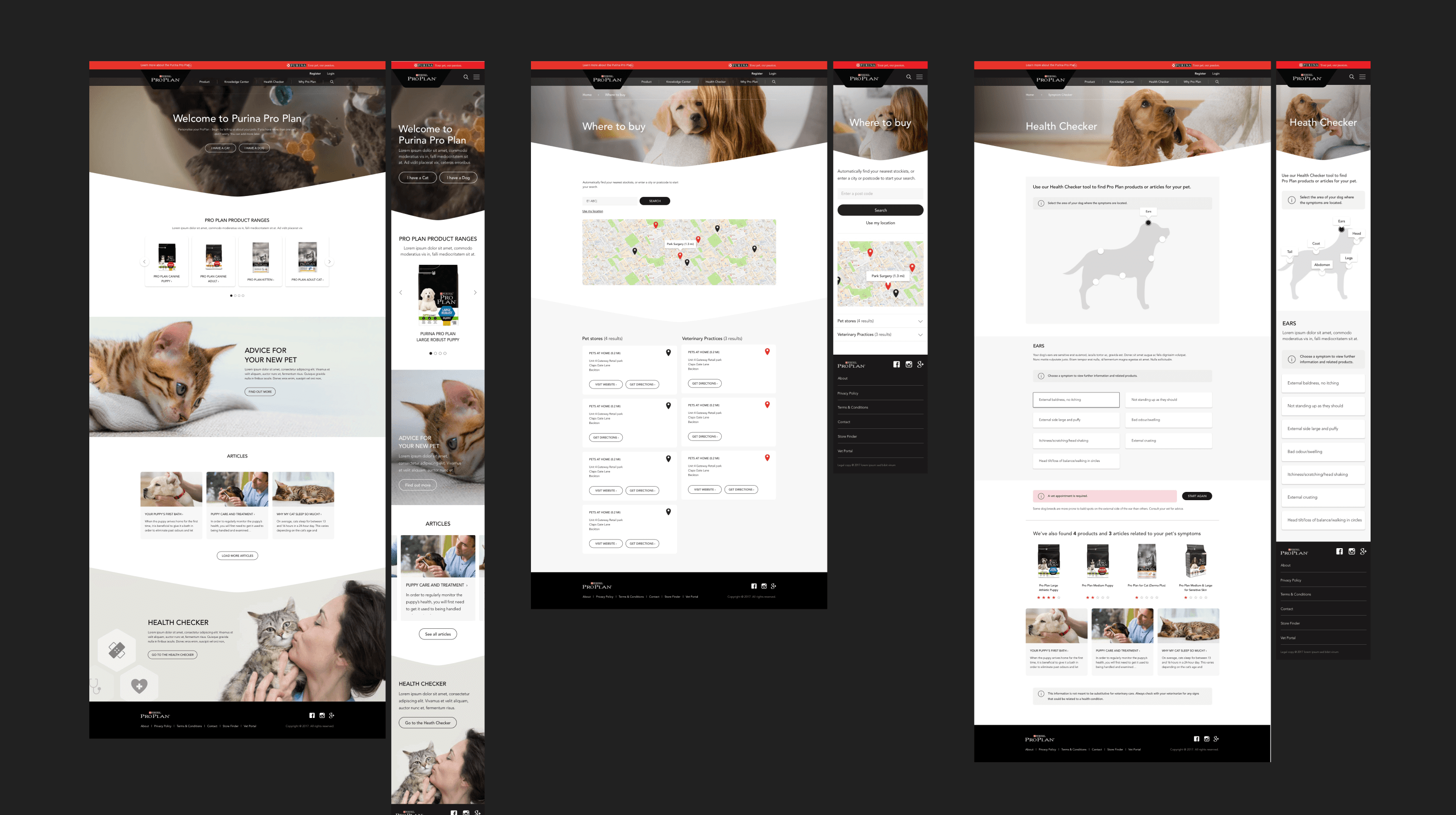
I worked alongside the UI designer, who began building a Sketch stylesheet with basic colour and text formatting, building out and adding any molecules they could identify as ‘done’ from the UX process, ahead of design time. This made it incredibly easy to design the final page templates for the client and also made it easy to make changes retroactively – which, even with the best of processes, end up being needed more often than not. When the project resource was adjusted as the exploration stage came to an end, I stayed on in a UI design capacity, finalising the Sketch designs and writing the delivery documentation for the impending build by a third-party agency based in South Africa.